Interactive Storytelling Website

Timeline:
September 2021-April 2022
Project Type:
University Project
My Role:
Project manager, UX/UI, Illustrator, Writer, Marketer
Tools:
Figma, HTML/CSS,
Photoshop, Illustrator,
After Effects, JavaScript
# of team members:
Six
Context
Climate change is a serious issue that is affecting many areas around the world in many different ways. Using storytelling to create awareness about this issue is an effective method to properly educate others on such a topic that can get pretty large and complex. The goal of 'Sincerely, Earth' is to create a story that people can relate to, learn from, and hopefully encourage and inspire others to initiate some form of action. The site itself is interactive, but the story is more on the dynamic side, which means is that the conclusion of the story is already pre-determined. The website includes a story, through 2D illustrations and design, and we incorporated animations and parallax effects. We also included interactive elements that users can interact with, with background music and sound effects. Users are able to view information about potential and existing solutions. We hope that through this website it will inform the younger generations about climate change in a way that keeps them engaged and gives them hope.
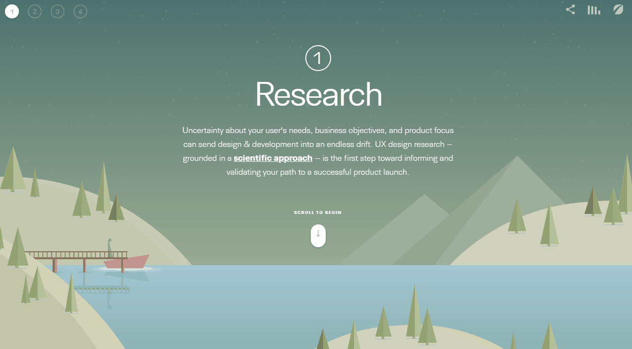
Research
Our Website Goals
Interactive
Creative
Educational
Research on Climate Change
Initially we thought we would make a site that teaches people what they can to at home to reduce their carbon footprint, however once I started researching the topic I learned the following:
-
The idea of reducing our individual carbon footprint was actually propaganda created by British petroleum in 2004 to shift the carbon problem from industries like themselves to the average person.
-
The pandemic has shown us that in 2020 after staying at home, not using transport, consuming less, it only reduced CO2 emissions by 7%.
-
If one person eliminated 100% of their emissions for the rest of their life they would save a second worth of emissions from the global energy sector.
From these findings we started to shift the solutions we present in the website to explain how we need systemic change to cut 25 billion tons of carbon emissions to avoid global temperatures rising by 2C. We presented the following solutions:
-
Spreading awareness
-
Investing in cleaner technology
-
Voting for the right politicians who plan to implement the right changes and can change laws to incentivize technology that assist in preventing climate change, and placing harsher punishment on industries instead of caving in
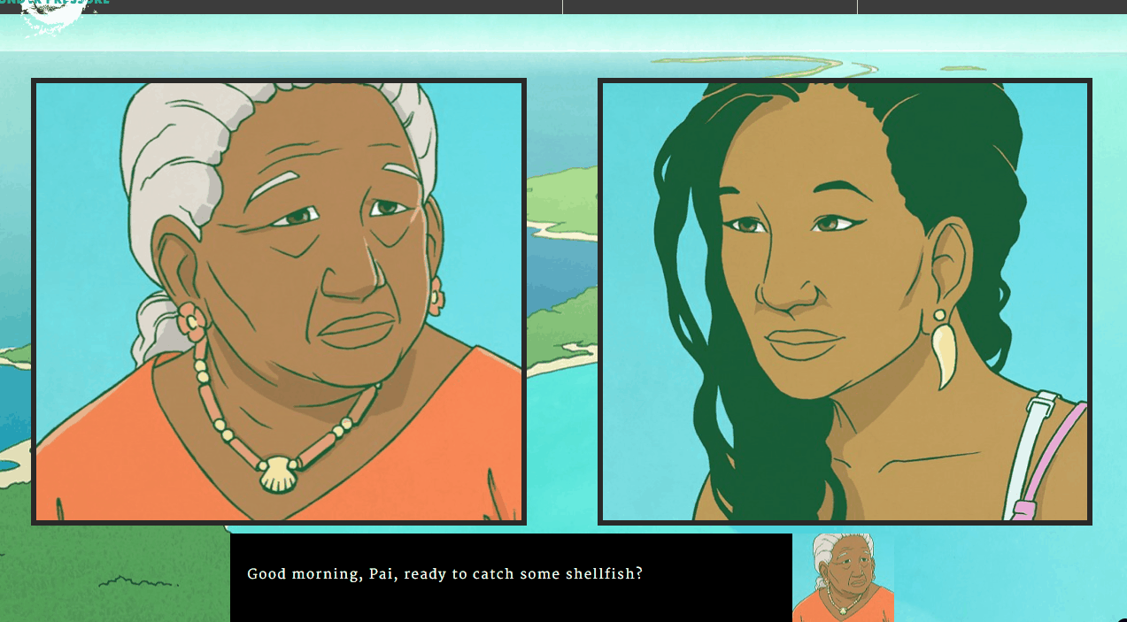
Research on Interactive Storytelling Websites
We looked at different examples of websites that were similar to what we wanted to do and used it as inspiration for our own site. Here are some examples of them:
Why a storytelling website?
Stories help explain complex concepts in a simpler way and can help to establish a strong emotional connection with readers which is what we wanted for a website about climate change.
What makes a good storytelling website?
Much like how we expect to see a moral at the end of a book, we expect to find a purpose at the end of a site with a storytelling experience. The site should engage the audience and encourage them to take some action by the end.
How to create a storytelling website?
-
Identify a hero
-
Create a setting where things will take place
-
Develop an action that contains a conflict
-
Create a surprise factor
-
Add a moral/conclusion
-
Keep it short and sweet
Define
User Persona
The original user for our website were university students aged 17-21, however after receiving feedback from professors we changed the user age group to 11-14 years of age. We also agreed with the feedback since this age group is starting to learn about climate change and we felt a website like this would be a great tool for middle and high school teachers to utilize in their classroom. Moving forward we adjusted our site to look and read in a level suitable for that age group.
Andrew Johnson
Andrew is a curious child who likes reading and playing video games.
He has ADHD and finds it hard to concentrate for long periods of time, so even though he enjoys reading he usually needs breaks and books that engage him more to make it easier for him.
I love to learn new things
about the world.
Motivations
-
Self-growth
-
Doing well in school
-
Helping others
-
Increasing knowledge
12 Years Old
Private School
Ontario
Pain points
-
Long blocks of text
-
Being rushed on quizzes
-
No imagery associated with text
Strengths
-
Hard working
-
Resilient
-
Observant
-
Optomistic
Frustrations
-
Inability to stay still for long periods
-
Quick to be disinterested
-
Anxiety
Ideate
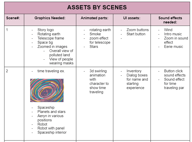
Scene Assets
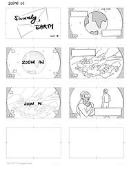
We created a table that included all the assets we wanted to incorporate in each scene.
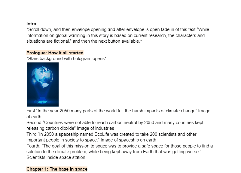
Script
Using another group members story idea I created our script. It went through 5 different iterations before we came to our final script.
Build
Wireframes
Me and the lead designer worked together to create the wireframes for the story.


Initial Website Creations
Our team had alpha, beta, and gamma presentations throughout the year where we showed our initial creations to get feedback on it. To build the site we used Illustrator and Photoshop, HTML, CSS, JavaScript, and Three.js.
Test
User Testing Results
We conducted user interviews which had users think aloud while going through the story, and then rate parts of the website. The statistics below are from the beta testing from 12 testers aged 11-14.
User Satisfaction Rate about the Story

100%
100%
80%
70%
Educational about climate change
Completion time (30 mins)
Story plot
Relatable story
We received user feedback about the story plot to add a more in depth backstory, based on that we added a prologue.
Difficulty of the quizzes

50%
Easy
10%
Hard
40%
Normal
We tested the users on the quizzes to ensure that they were the appropriate level for the age range. We got feedback to include information about quiz questions in previous scenes and to give an explanation after every quiz question.
Ratings of the story, art, and interactions out of 5
5

Story
Art
Interactions
3.8
3.5
3.7
0
1
2
3
4
For the art we got feedback to include more details in our art and include more changes in character expressions. We were also told by users to include a menu option to allow them to view previous scenes. Also to include smoother transitions between scenes and to adjust the positions of some UI.
Final Design
Intro
The login allows the user to enter the app while being able to view their password, remember the login and sign in with biometrics for an easier signing in process.
Video lectures
The user can now watch video lectures for each of their classes using the application, and also add new links for their classes.
Student accounts
The user can view their student accounts including their campus card, tuition, scholarships, and grants from the application.
Final Design
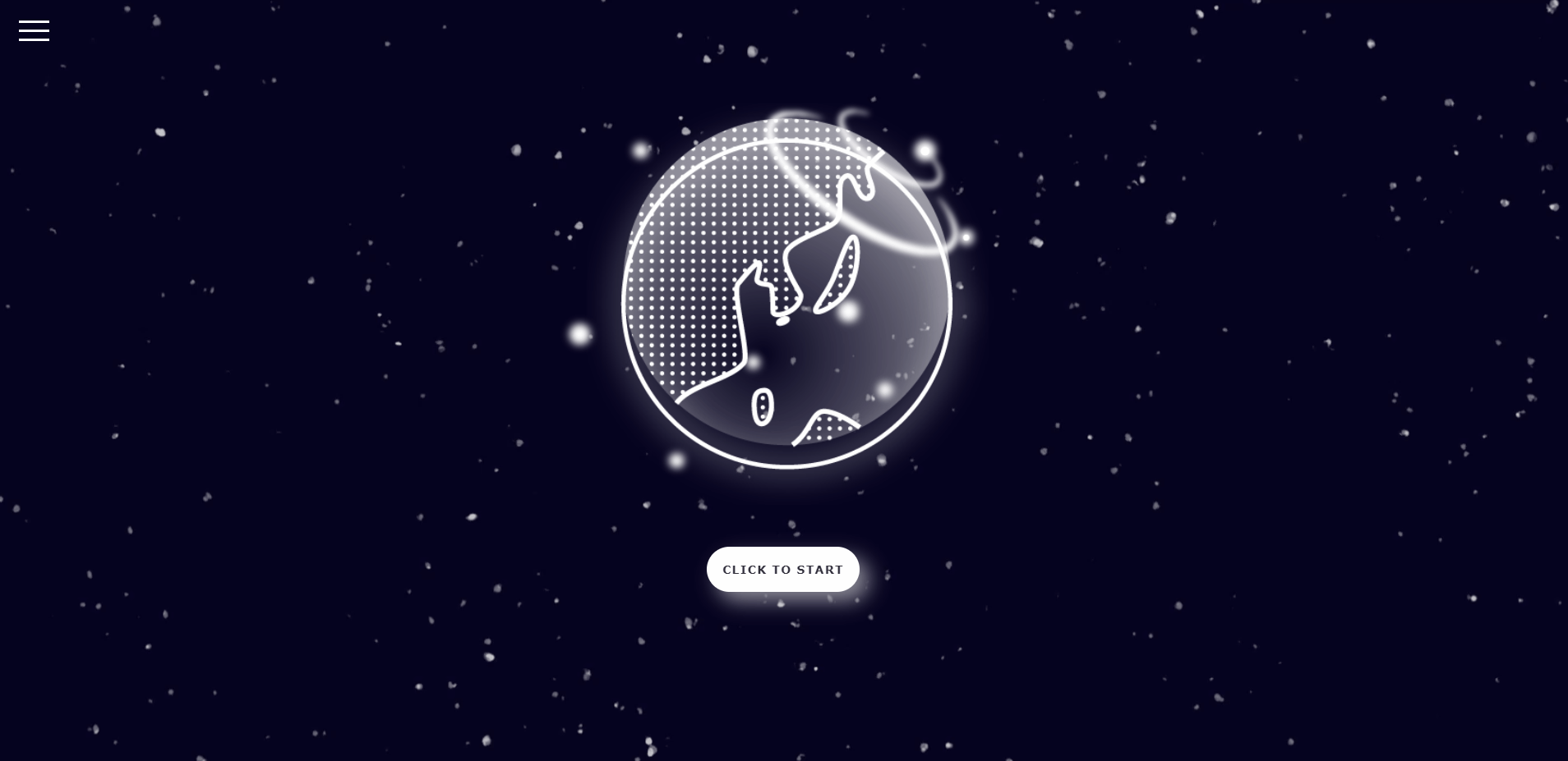
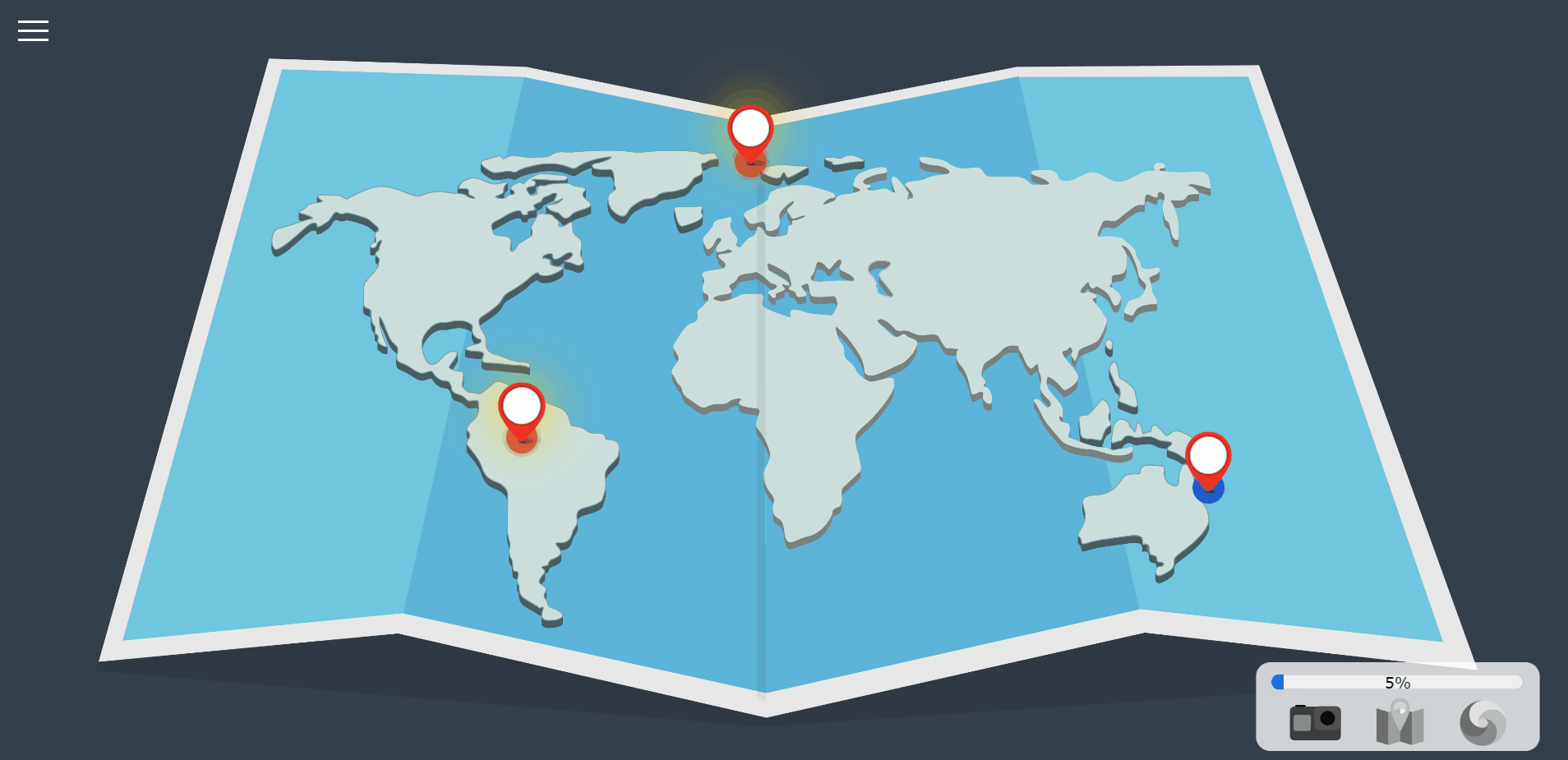
Intro
When the user first enters the website they see this screen. There is a hamburger menu on the side which shows them all the chapters they can unlock, the help menu, and the ability to mute sounds. Per user feedback we also included instructions so people know the white button means to go to the next screen.
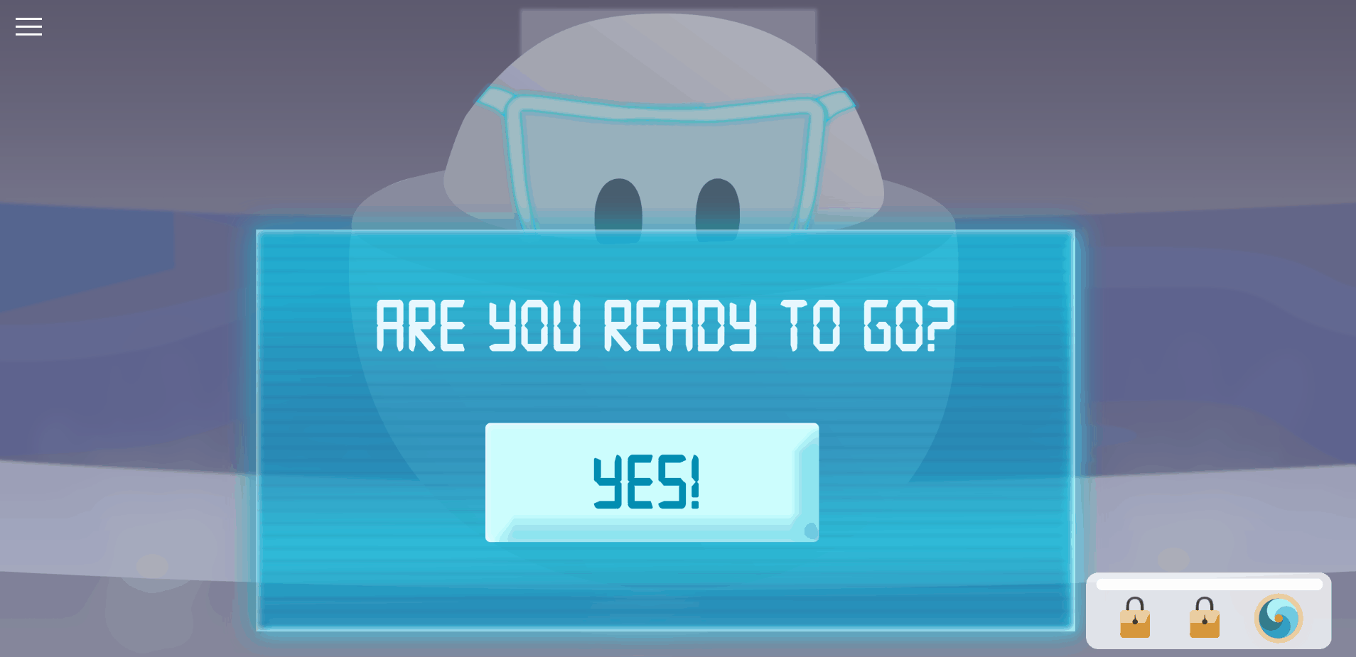
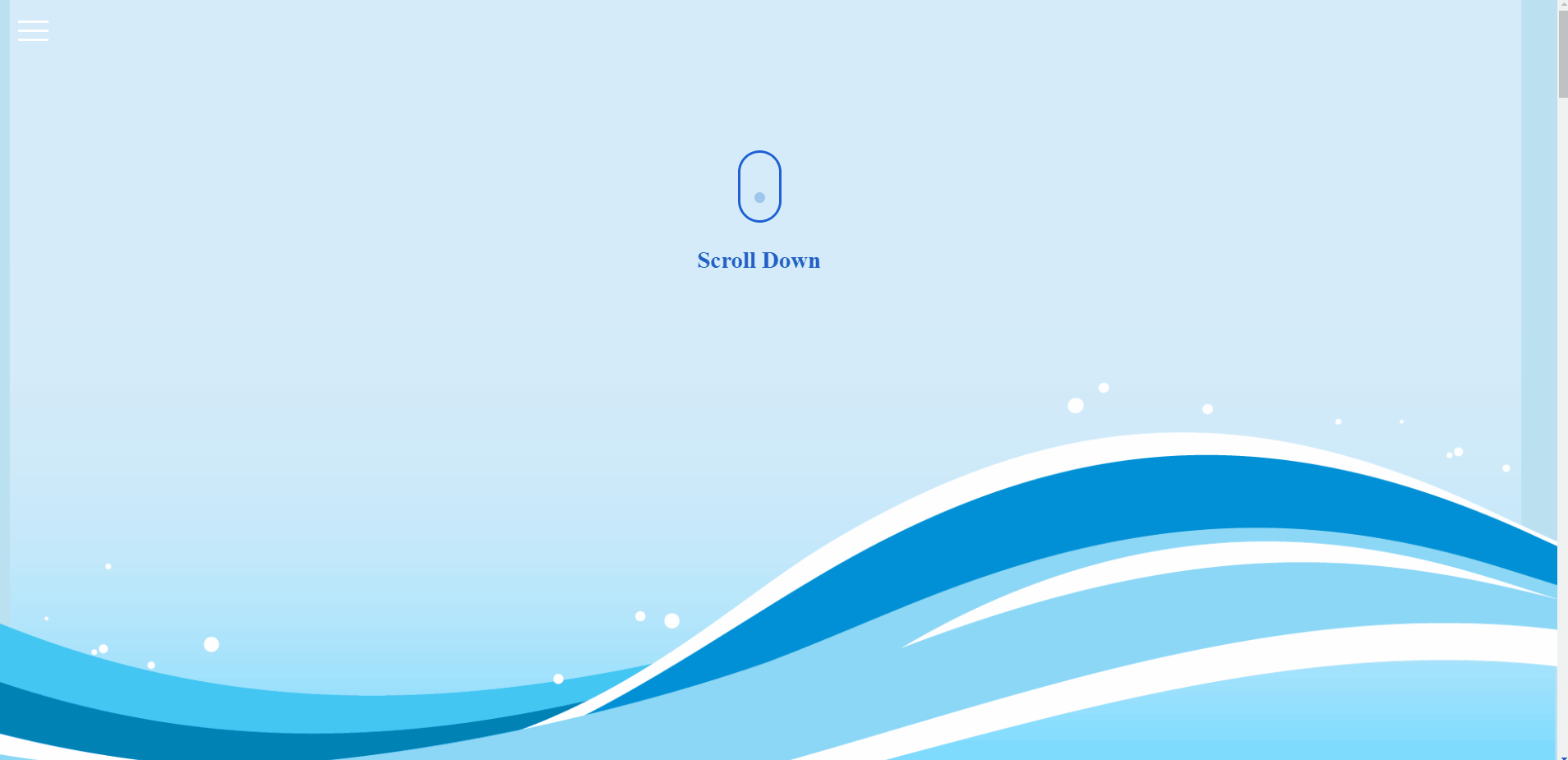
Transitions
We had different ways of transitioning throughout the pages. One way was through a rectangle button when we wanted to transition to bigger things like the 3D tunnel. We also used a white circle button so the user could click between pages. To make it accessible we had the option of using the keyboard to go to the next page.
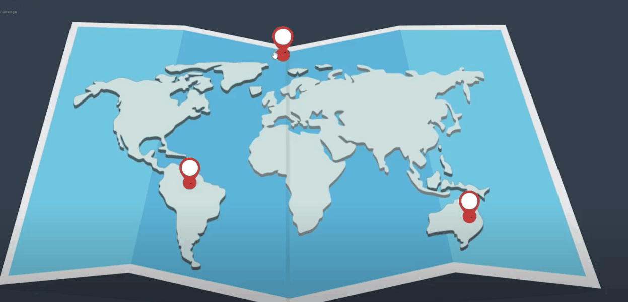
Parallax Scroll
We had multiple scenes with parallax scroll since we thought that would be an interactive way to animate since users can control the pace they go at, while also looking interesting.
Ending
At the end we show a final parallax scene with a hopeful ending and give the users the ability to restart the story.