Carleton University app re-design

Timeline:
January 2021-April 2021
Project Type:
University Project
My Role:
UX, UI, Research, Tester
Tools:
Figma
# of team members:
Four
Context
I worked with a team of four to improve Carleton University's mobile app. We focused on the most significant UI issues that have conflicted with our understanding of design concepts. The Carleton mobile app was first released in 2011, and since then there have been many complaints against the app, especially within the app store where they have a rating of 2 stars. Our motivation and larger objective is that as students ourselves, we believe it would help a lot of students and faculty members with classes, scheduling and much more with our re-design. These constant issues and lack of feedback in the app can cause harm, especially to those users with disabilities who require proper interface design and feedback. We believe that our re-design can help ease stress and frustrations that this app currently gives, and hope to improve user experience.
Research
Identifying the problem

Login
There is an issue of having to constantly login and receiving errors without any feedback, causing frustration within users.

Online lecture links
For YouTube and Big Blue Button links, the user perceives to be able to use these features as both are visible on the app creating perceived but not actual affordances since you can’t watch them on the app.

Buttons
There was first the issues with the buttons, for example when trying to return to the home screen of the app the user will realize that what was first perceived as a button is actually not a button, and instead of being told that what they are trying to click isn’t clickable, the user is left guessing.

Schedule
Another issue comes with depicting the timetable, as all Monday classes and the dates have been removed and all classes of the week have been moved a weekday ahead causing confusion.
Define
User Persona
After identifying the main users and reading people personal experiences with the app I created this user profile.

Ideate
Task Analysis
We created task analysis on the tasks we wanted to include in the final prototype. I created the login one while my team members worked on the others.


Rough Sketches


Build
Low-Fidelity Prototype
We created task analysis on the tasks we wanted to include in the final prototype. I created the login one while my team members worked on the others.
Rough Sketches

Test
Cognitive Walkthrough Analysis
We conducted user interviews to find and resolve issues from our initial design.

After doing a cognitive walkthrough with multiple users on our Low-Fidelity Prototype we found 5 common issues:
-The Big Blue Button was hard to find
-Interactive elements are not always obviously interactable
-The iconography for the toolbar was unclear
-The toolbar layout was confusing
-There was no back button
Final Design
Login
The login allows the user to enter the app while being able to view their password, remember the login and sign in with biometrics for an easier signing in process.
Schedule
The schedule clearly lays out all the classes and allows for additional classes to be added.
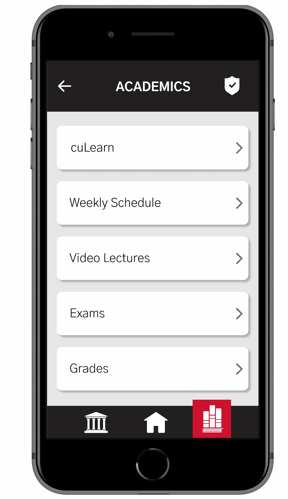

Video lectures
The user can now watch video lectures for each of their classes using the application, and also add new links for their classes.
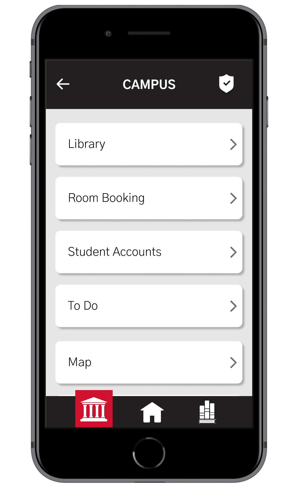
Student accounts
The user can view their student accounts including their campus card, tuition, scholarships, and grants from the application.
What I learned
I learned the importance of user testing since even though we thought our initial designs made sense to us, the testers might find additional issues.
What I would do next
Next it would be better to test the final mockup again and iterate the design. I would also design other pages on the app.
